NEW DESIGN GUIDELINES FOR ARTISTS
The industry has shifted. And so have we. It’s a new, exciting world of ‘Direct to Garment’ digital printing (DTG). And new times call for new design guidelines. We’ve received a lot of questions lately about our 6-color limit, whether we still need color-separated files, about halftones vs. gradients, and why nacho cheese is so tasty. So here are our answers: Forget about it (sort of)! Yes. Sometimes. And we don’t know why but now we’re hungry.
Still need clarification? We’ve come up with a handy-dandy acronym to help explain (and help your REMEMBER) the new guidelines:
S.L.A.T.E.
S is for Sizing
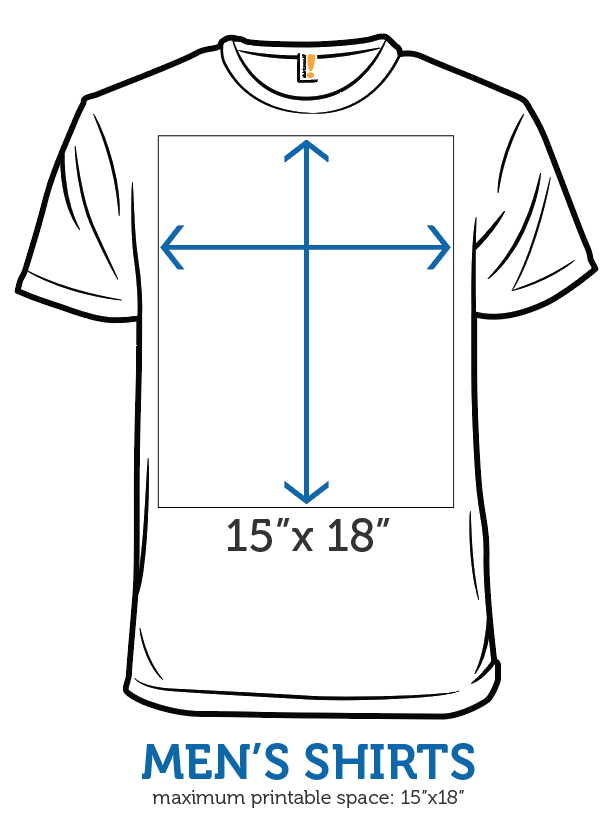
- All art files should now be formatted as a 15” x 18” canvas at 300 DPI.
- Keep all art within that frame. Anything extending beyond it will not be printed.
- Size and place the art files within the 15 x18 frame. As shown in the image below, the top of that frame sits approximately 3 centimeters (1.25 inches) below the neckline. This is the highest we are able to print.

L is for Layers
We test print every design we sell. And we frequently need to make adjustments to the colors within a design to achieve the highest possible print quality. Files with color-separated layers allow us to make these adjustments quickly and with greater precision. As such:
- All art files should still contain color-separated layers.
- If your design uses background gradients or halftones, please place them on a separate layer, even if they are the same color as another element in the design. This gives us a greater level of flexibility when troubleshooting printing issues.
- To avoid confusion, it is best if the last layer of your file is filled and labeled with the appropriate tee color.
A is for Artwork
We’re no longer imposing/enforcing the 6 -color limit. Let the rejoicing begin! However, as a caution: if you use an excessive number of colors, it may limit the range of non-shirt products that we're able to print your design on. We recommend somewhere between 6 and 12, but you’re free to add as many as you like.
Also, good prints require good contrast! A design that looks great on your illuminated screen, may turn out looking flat or a little washed out once it's printed if there isn't enough contrast in the design. So it's always a good idea to use a little more contrast between colors than you think you might need, especially between colors that are very similar.
T is for Transparencies
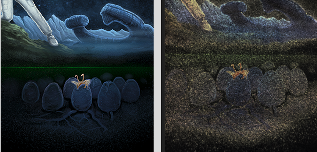
DTG printers have a notoriously difficult time with partially-transparent pixels. This is because they can't print with partially-transparent ink, and they lay down a white base beneath everything they print (except pure black). The result is that any partially-transparent portions of your design that are printed directly on the shirt will end up looking like a muddy, hazy mess.
For example, the design below uses semi-transparent pixels to fade parts of the artwork into the black shirt. This looks great on screen, but the DTG printers are unable to accomplish the same effect and end up producing fuzzy gray blobs, instead.

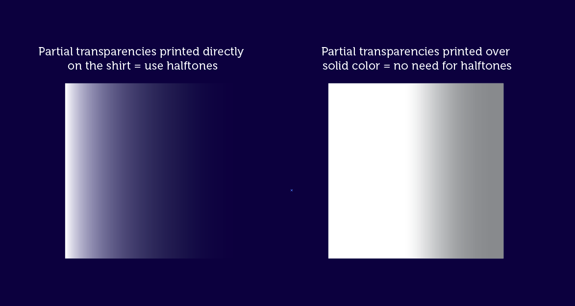
If you want to achieve this type of faded or partially see-through effect on a part of your design that will be printed directly onto the shirt, you will need to use halftones. We've found that halftones of 30 LPI or larger tend to work best.
But halftones are only necessary when the partially transparent pixels are being printed directly on the shirt. It typically isn’t an issue if you want to use partial transparencies to create shading effects or something similar, as long as the transparency is on top of a solid color (see the example below).

E is for Export
We use Photoshop to create all of the print files and sales images for everything we sell. This means every file we receive must first be converted to a PSD before we can use it. If you use a program other than Photoshop, you can save us a little time and effort by exporting your artwork as a PSD before sending it to us.
To export from Illustrator, select File > Export > Export As… In the dialog box, select “Photoshop” from the dropdown menu, check “Use Artboards,” and select “Export.” In the next dialogue box, select “Write Layers” (make sure both edibility boxes underneath are also checked), and select “None” from the anti-alining dropdown.
If you use a different design program, most are still able to export to the PSD format. If you encounter any issues, hit up the forums for advice. And if ever in doubt, sending the original art file in the program you used to create it is always a safe place to start.
Summary: You'll do GREAT if you remember S.L.A.T.E.!
Weigh in on the forums if you have any questions, and make sure you head over here to download and start using our updated design templates!
